Customizing Offer Display
Overview
Salelift provides powerful customization options to ensure your offers match your brand and provide the best possible user experience.
Display Locations
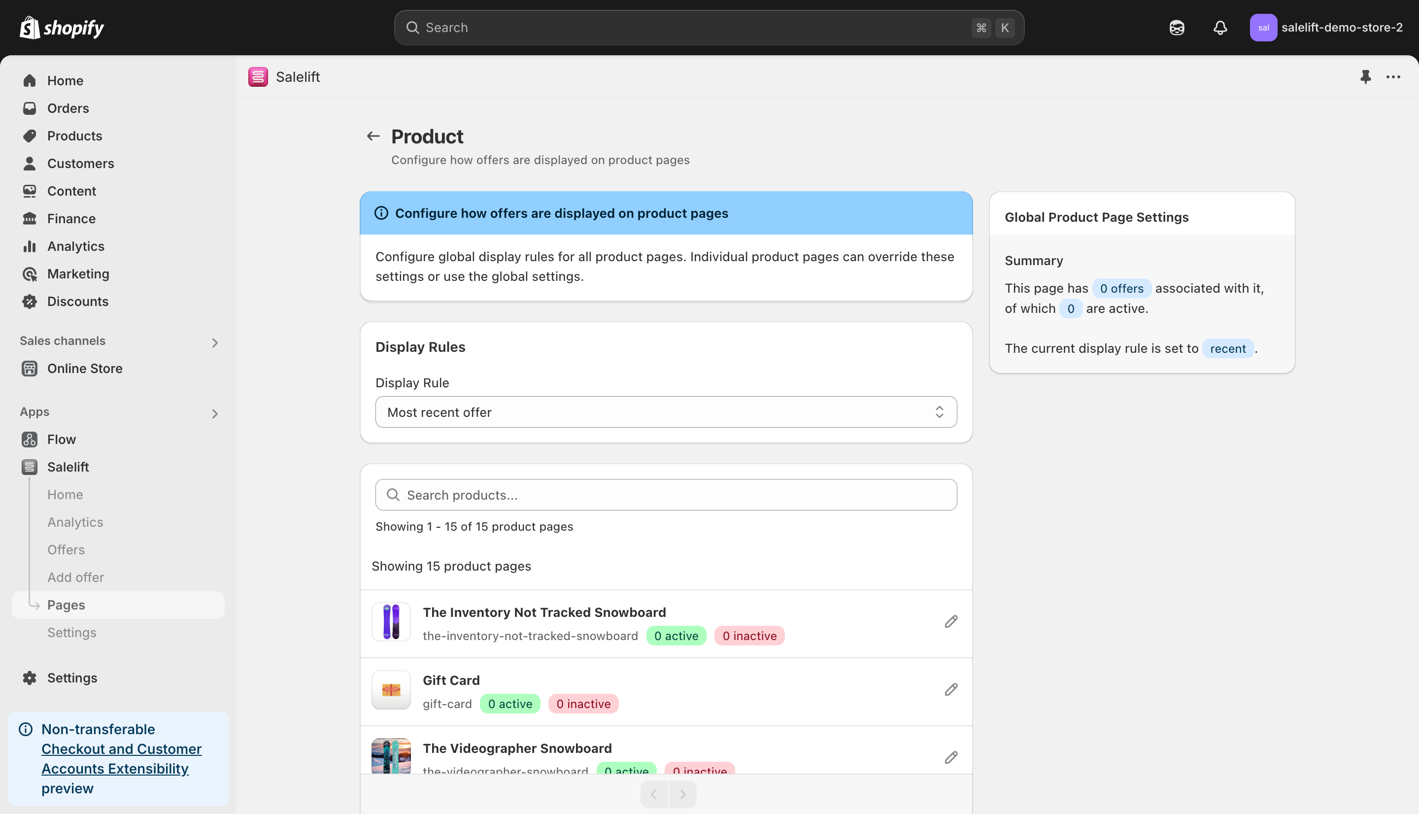
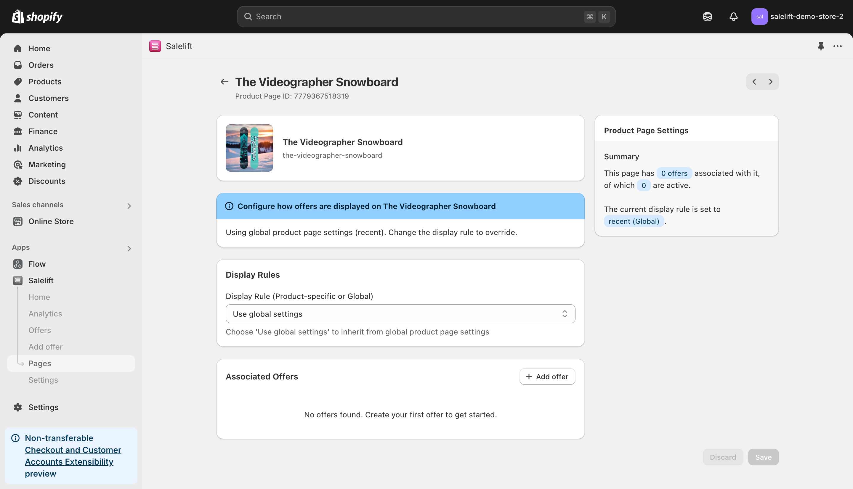
Product Pages
Configure where offers appear on product pages:
-
Position Options
- Below Add to Cart
- In Product Description
- Sidebar
- Custom Position
-
Display Rules
- Show based on product category
- Price threshold triggers
- Customer segment targeting
- Time-based display
Cart and Checkout
Customize offer presentation during checkout:
-
Cart Page Options
- Top of cart
- Below cart items
- Sidebar placement
- Modal display
-
Checkout Flow
- Pre-payment placement
- Order review integration
- Post-purchase display
- Thank you page offers
Visual Customization
Design Elements
-
Colors and Branding
- Primary button color
- Secondary colors
- Background styles
- Border options
-
Typography
- Font family selection
- Text size adjustment
- Font weight options
- Text colors
-
Layout Options
- Grid vs. List view
- Image size and position
- Content spacing
- Responsive behavior
Component Styling
-
Offer Cards
- Border radius
- Shadow effects
- Hover states
- Animation options
-
Buttons
- Size variations
- Style options
- Icon integration
- State styling
-
Product Images
- Aspect ratio
- Thumbnail options
- Zoom behavior
- Gallery display
Advanced Configuration
Custom CSS
Add your own CSS for complete control:
.salelift-offer {
  /* Custom styles */
}

.salelift-button {
  /* Button customization */
}

.salelift-product-image {
  /* Image styling */
}
JavaScript Hooks
Available events and callbacks:
window.Salelift.on('offerView', function (offer) {
  // Custom tracking
});

window.Salelift.on('offerAccept', function (offer) {
  // Conversion handling
});
Mobile Optimization
Responsive Design
-
Mobile Layouts
- Stack vs. grid views
- Touch-friendly buttons
- Simplified content
- Optimized images
-
Performance
- Image lazy loading
- Component lazy loading
- Minimized animations
- Reduced network calls
Testing and Validation
Cross-browser Testing
-
Browser Support
- Chrome/Safari/Firefox/Edge
- Mobile browsers
- Tablet optimization
- Legacy support
-
Device Testing
- Phone sizes
- Tablet layouts
- Desktop resolutions
- Touch vs. mouse input
Performance Considerations
Loading Speed
-
Optimization Tips
- Minimize custom code
- Optimize images
- Cache effectively
- Load asynchronously
-
Monitoring
- Page load impact
- Time to interactive
- Memory usage
- Network requests
Best Practices
Design Guidelines
-
Visual Hierarchy
- Clear call to action
- Important info first
- Consistent spacing
- Logical flow
-
Accessibility
- Color contrast
- Focus indicators
- Screen reader support
- Keyboard navigation
Implementation Tips
-
Code Quality
- Minimal custom code
- Clean CSS structure
- Efficient selectors
- Performance first
-
Maintenance
- Document customizations
- Version control
- Regular testing
- Update strategy
Getting Help
Need assistance with customization?
- Contact our support team
- Join our developer community
- Access code examples
- Request custom features
Remember to test all customizations thoroughly across different devices and browsers before deploying to production.